2012-2017
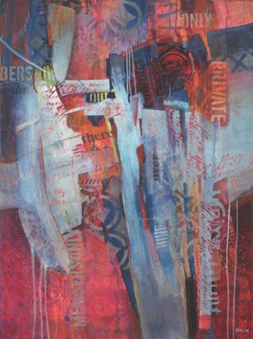
An interior designer asked me if I had any large paintings in reds, blues and grays. I responded by painting this proto-landscape. Red and blue are difficult to handle together because they tend to vibrate next to each other. When I introduced bits of orange, yellow and acid green it calmed down. The words refer to privacy and inner thoughts. Although the painting did not fit in the intended space, her request gave me something interesting to work toward.
